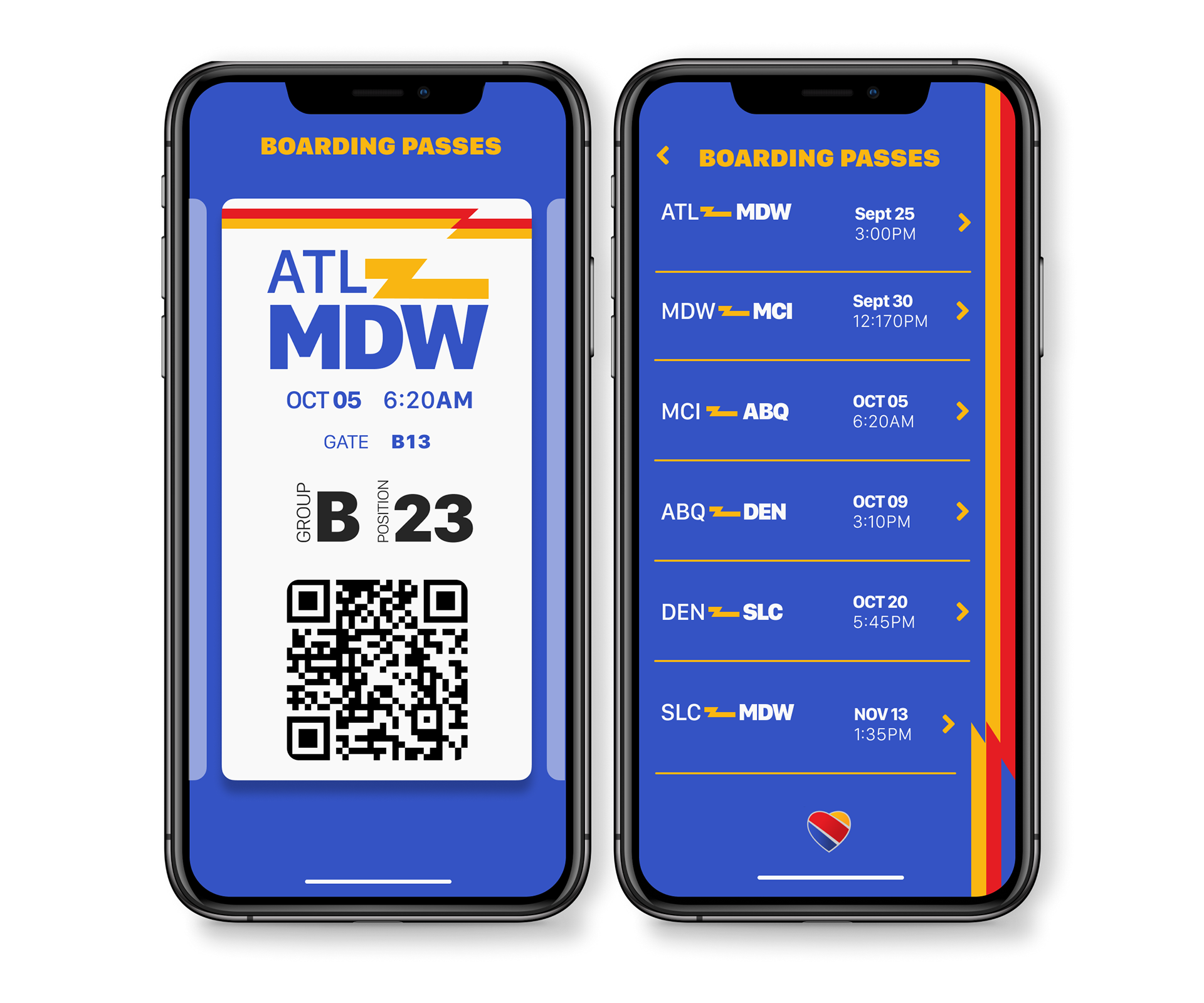
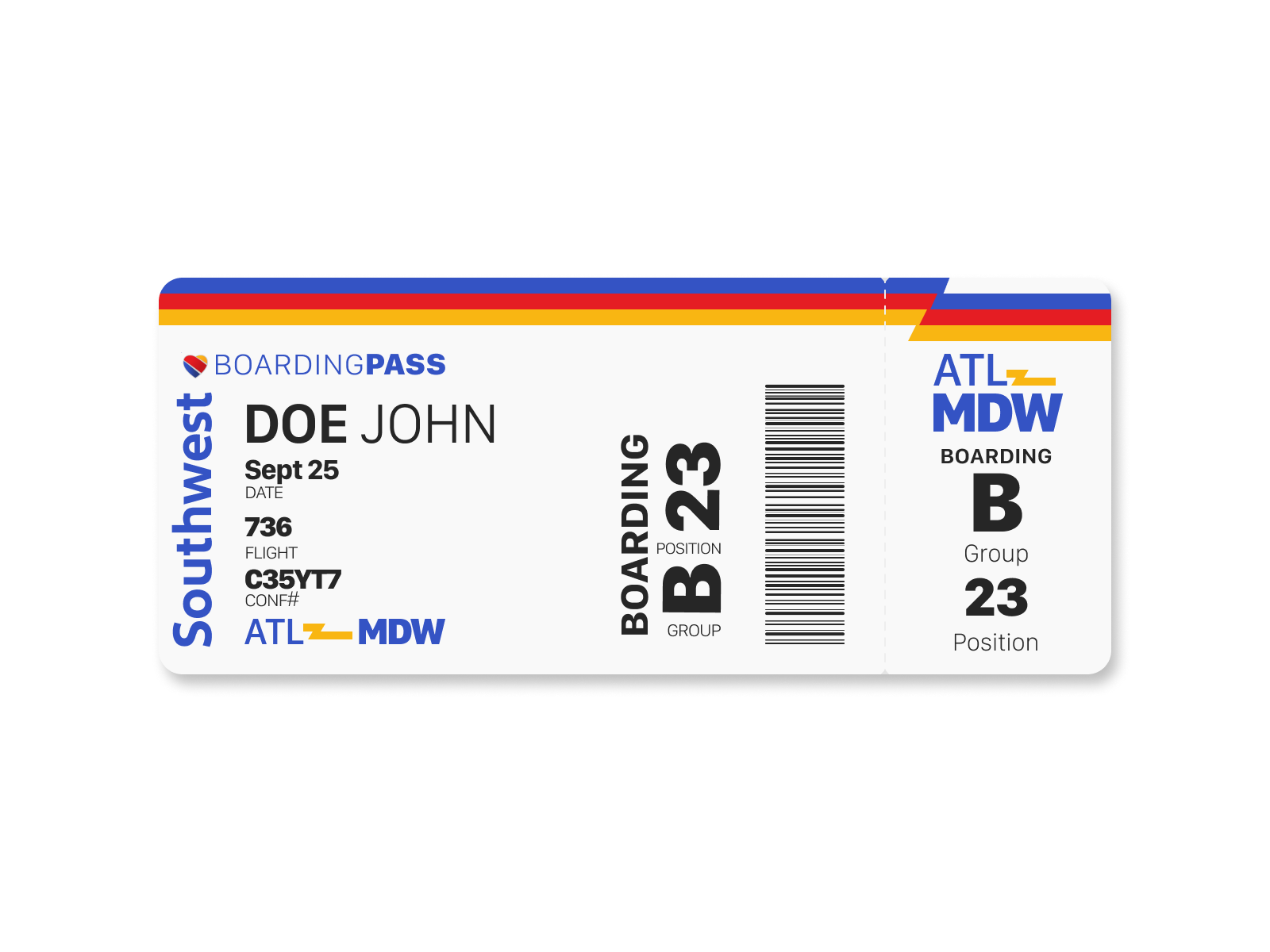
Daily UI # 24: Boarding Pass.
As a frequent flyer on Southwest Airlines, I am all too familiar with the boarding pass experience that they offer both in the mobile form and the physical form.
So when I was given the prompt of creating a boarding pass, I took that as an opportunity to investigate some new visual treatment and UX treatment of my favorite airline.
The most important part of these designs were that all of the primary design elements worked well in a system.
Secondly, all elements needed to exhibit a distinct hierarchy that correlated to the user's priority in information consumption.
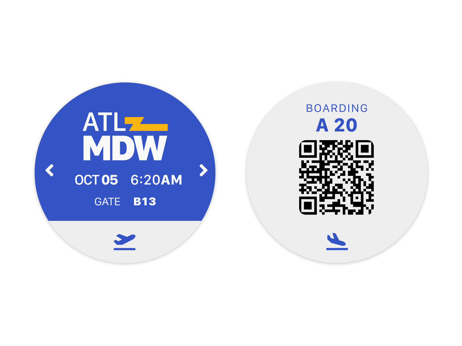
Once the mobile and paper experiences were established, I wanted to see how this experience might extend to a watch experience as many applications are moving in that direction already.
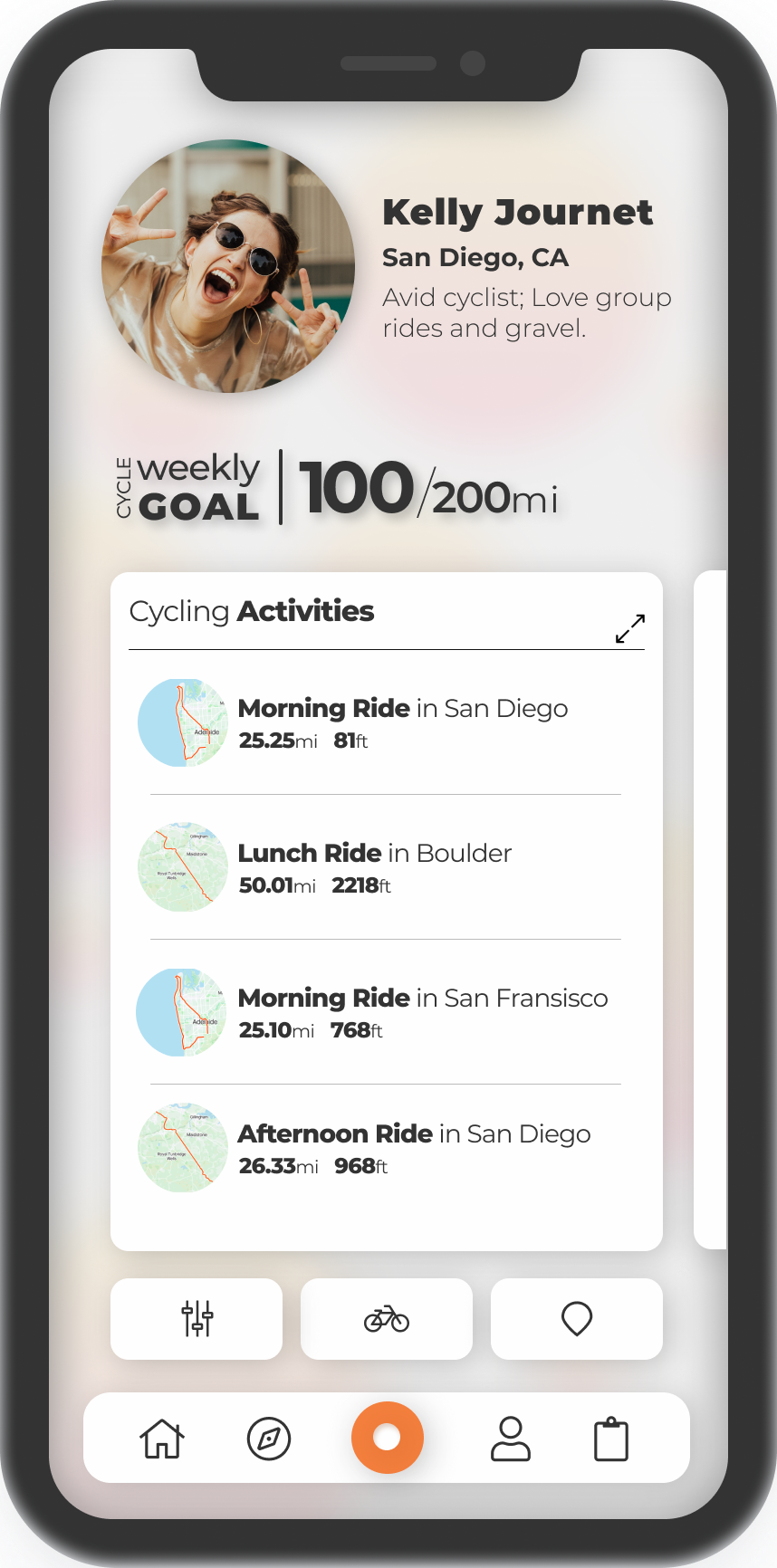
Daily UI # 6: User Profile.
For this prompt, I decided to redesign the user profile screen from one of my favorite apps: Strava.
I have always found navigating the existing profile screen a massive challenge due to the odd placement of some elements.
For example, the "activities" page is at the very bottom of the page and requires navigating away from the screen in order to see any data.
Here, I decided to remedy that by showing a 5 entry preview of the data and orienting it in a carousel format to allow a preview of multiple sports without navigating away from the page.
Next, I wanted to still retain some of the lesser functionality from the existing page so that is moved beneath the MVP of the page yet still visible without scrolling needed.
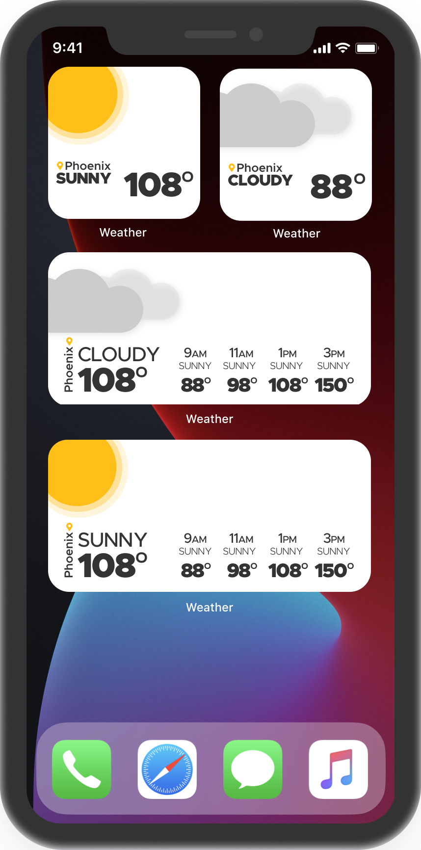
Daily UI # 29: Weather.
Around the time that I started this prompt, Apple had just released their rework of widgets.
With the move to the home screen and the different sizing, I wanted to take the opportunity to experiment and get used to designing for the cropped form factor.
This selection of weather displays is meant to be an exercise in minimalist design as well as widget exploration.
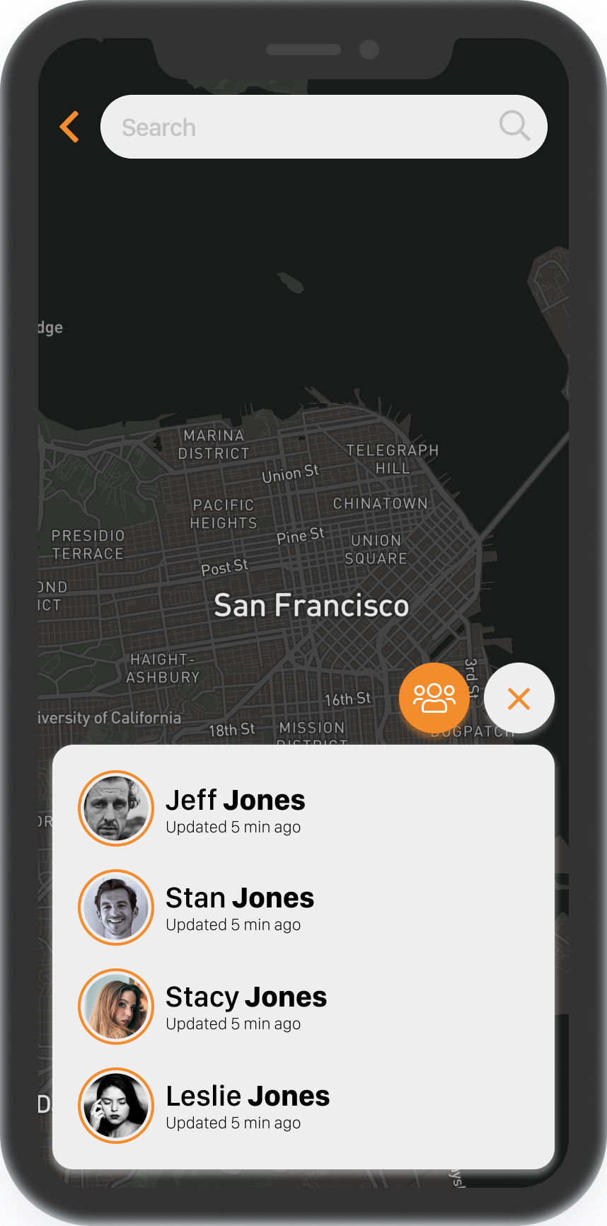
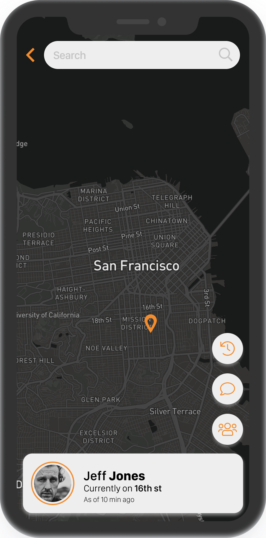
Daily UI # 20: Location Tracker.
The goal in this project was to create something that was packed full of only the necessary functionality.
When I was first thinking through how I would lay this out, I made a giant list of all of the cool functionality that could be contained in a location tracker.
Then, it was necessary to take a step back and nail down only the most important features; The map of each location, a list of people, the location history and as a stretch, maybe the ability to send a message.
Finally, The design needed to be minimal to reflect the process that preceded it.
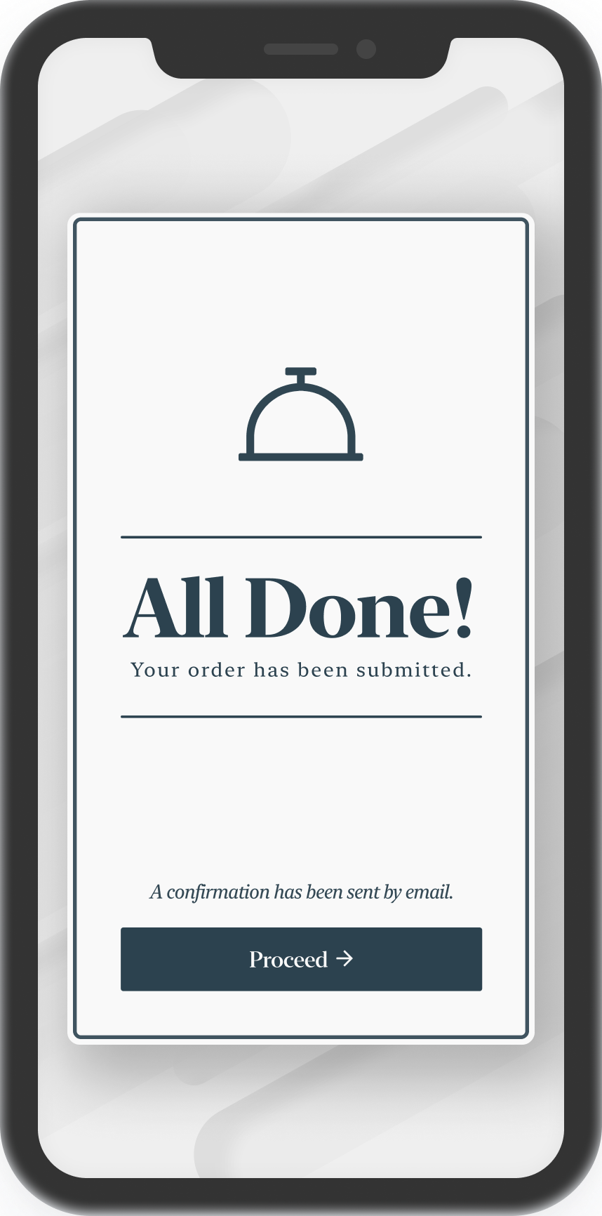
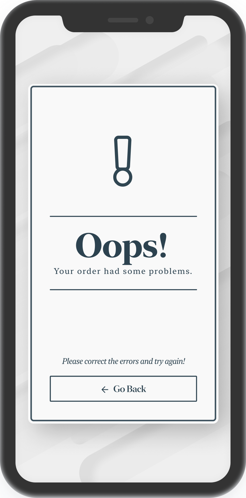
Daily UI # 11: Flash Message.
When starting this challenge, I wanted to push myself to design outside of the current trends of neumorphism and sans-serif type.
Therefore, the story surrounding these two modals are that they are for a luxury, french restaurant in which you can order your food to be delivered (This was completed during the age of COVID after all)
It was a challenge to break the mold of the typical modernist styling that is very prevalent in app design but this elegant, luxury styling ended up being one of my favorite projects from the Daily UI selection.