App Information Reorganization
Goal: create wireframes which both introduce an element of "gamification" to the DIY tax process as well reorganize all of the screens and the information within them in order to move all "Personally Identifiable Information (PII)" to the end of the process and after the user has already paid for the service.
Purpose: To increase marketing value of the app in terms of advertisements or sponsored content included. Additionally, create a lighter, and less stressful experience for the user. Tax season is one of the most stressful times for people after all!
My Role + The Team: It was my responsibility to brainstorm what a more "game-ified" version of the tax experience would look like and how best we might accomplish this from a content and UX perspective. I worked alongside Rhiannon, the product owner for the DIY app as well as Harrison, an intern on the development side of the app. Harrison and I were responsible to fleshing out ideas and considering how best to implement these ideas from both a dev and design side. Rhiannon served as a guiding light in how to achieve the overarching enterprise goals.
Step one:
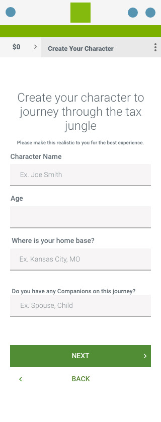
The screen to the right is one of a few proposed examples in which the user "creates a character" which embodies them and prepares the system to ask certain questions pertaining to their tax information yet does not gain any PII data. -- This was proposed as a long term solution, think 5 years down the road.
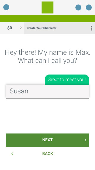
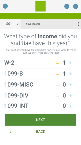
To simplify things, and give the interview process a more conversational approach, the " step 1" screen was broken down into individual screens and a more conversational tone was taken in the copy to feel more like a conversation and less like a boring old form to fill out.
Additionally, medium width flags were implemented to give the user some real time feedback and contribute to the conversational approach.
** All of these were meant to serve solely as wireframes and vehicles to ideation. Thus the non-brand green colors were used to show what was new **
Next, a form of this style was included for two large benefits;
First, in the current configuration, all of these screens would be shown to the user. That is a lot of unnecessary time that the user would have to spend in order to get to the end of the process.
Second, this form gives the backend system a primer of what screens it needs to display and cuts down on processing time of the user's tax form after the fact.
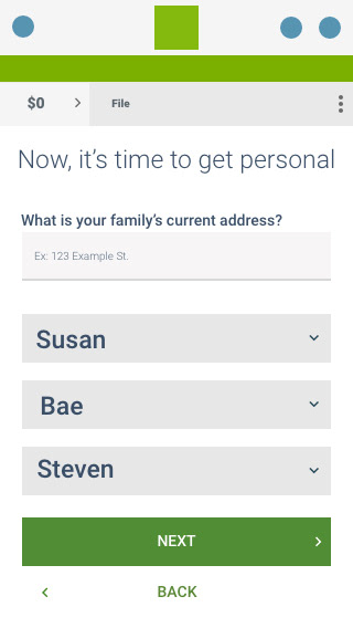
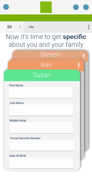
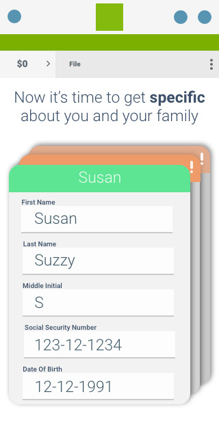
Fast forwarding a bit, after the user will have paid for the service, then they will be prompted to clarify their information by stating their home address and providing real names for the nicknames they previously used to enter financial data.
Additionally,
I got so interested in the idea of reimagining this process that I experimented with a new way to display multiple groups of information, such as when a user would have to associate their real information with a nickname.
The bar at the top of each card would serve as a status indicator which would help the user visually check to see if they still had to enter any information.